Design Process
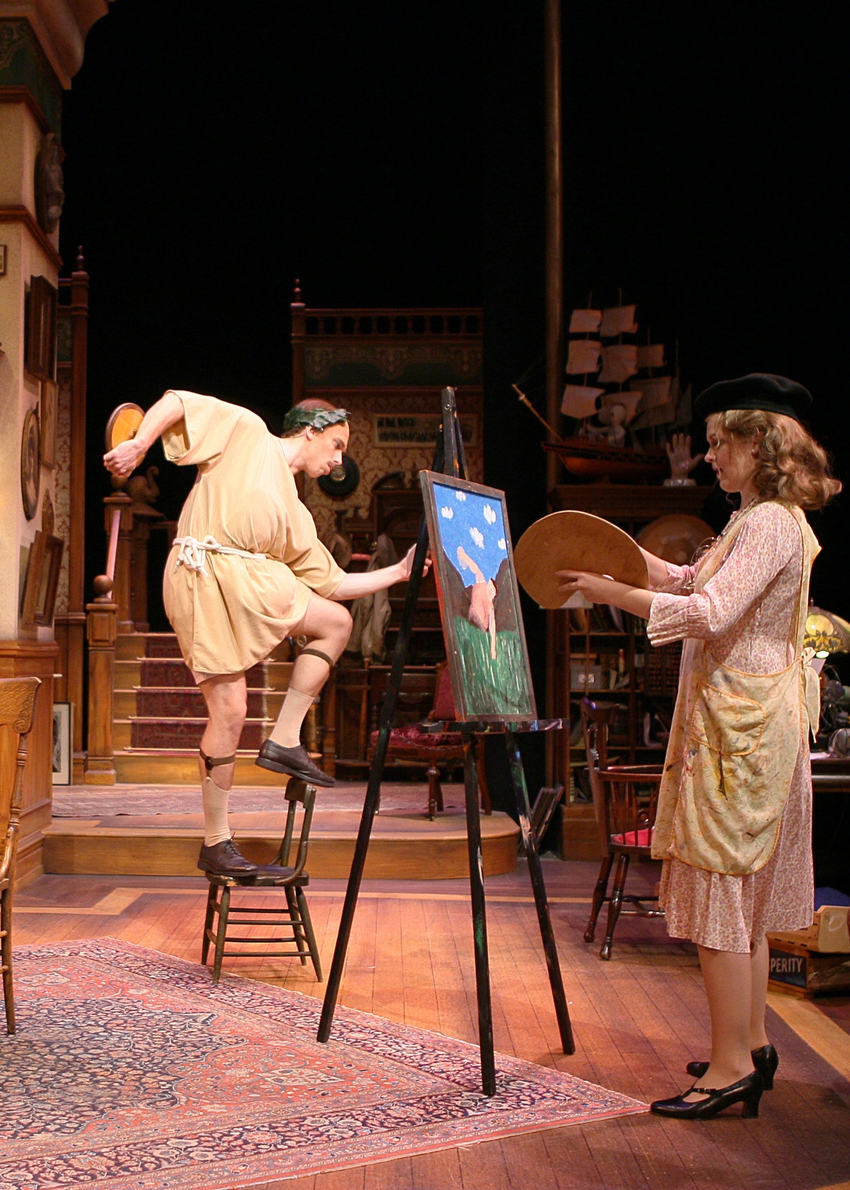
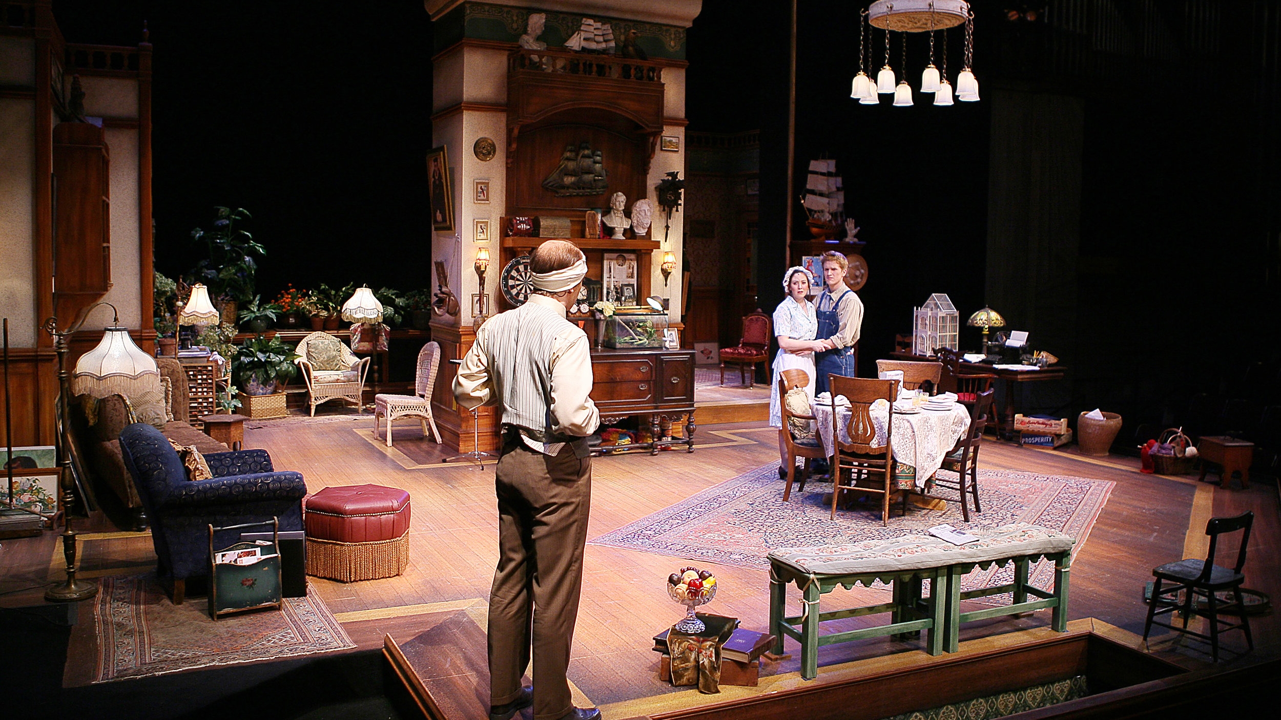
The spatial layout of the Vanderhof family home was designed to resemble and function as real rooms do.
The set floor and walls were at right angles and theatrically splayed walls were minimized. During scenes, the characters would wander out of sight behind architectural elements and into other rooms and hallways and pop back and forth into the scene for comic effect.
Set dressing, books and tchotchkes were chosen and placed around the set to reflect the ascribed personalities, ages, and interests of characters. Aspects of a warm and eccentric family were reflected in every nook and cranny of the Vanderhof home. The actors enjoyed wandering the set, looking through bookshelves, under chairs, opening desk drawers, and cabinets to find their character’s possessions and those that reinforced the family’s history and place in the world.
"Tom Umfrid's design work is always expertly detailed, subtly nuanced, and supportive of the script. He helps me do my best work." — Richard Hess, Director
Credits
By: Kaufman & Hart
Director: Richard Hess
Venue: CCM- College Conservatory of Music
Scenic Designer: Thomas C. Umfrid
Lighting Director: Renee L. Miller
Costume Designer: Elizabeth Polley
Technical Director: Richard Palmer
Prop Master: Kayleigh Baird
Stage Manager: Carter McElroy
Photographer: Mark Lyons


